UX Research • Mobile App • Wearable Device
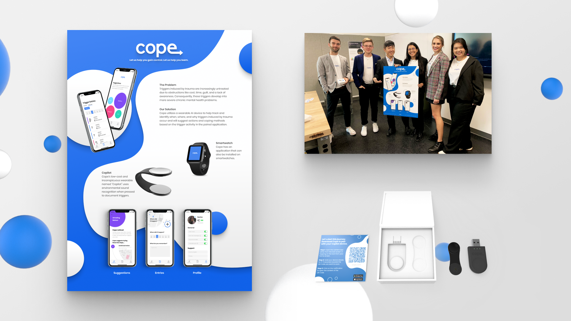
Cope : Trauma Management Ecosystem
Cope is a 10 week academic case study researching and designing a support system through a wearable AI device to help track and identify when, where, and why triggers induced by trauma occur; suggesting actions and coping methods through a paired mobile application.
My Responsibilities / Contributions

Team

Laura

Tucker

Cherie

Juliana

Charlie
Getting Started
Where to Begin
We were tasked with designing a product or service relating to human memory. Laura’s research on environmental emotional responses led us to trauma recovery.
Where Can we Intervene?
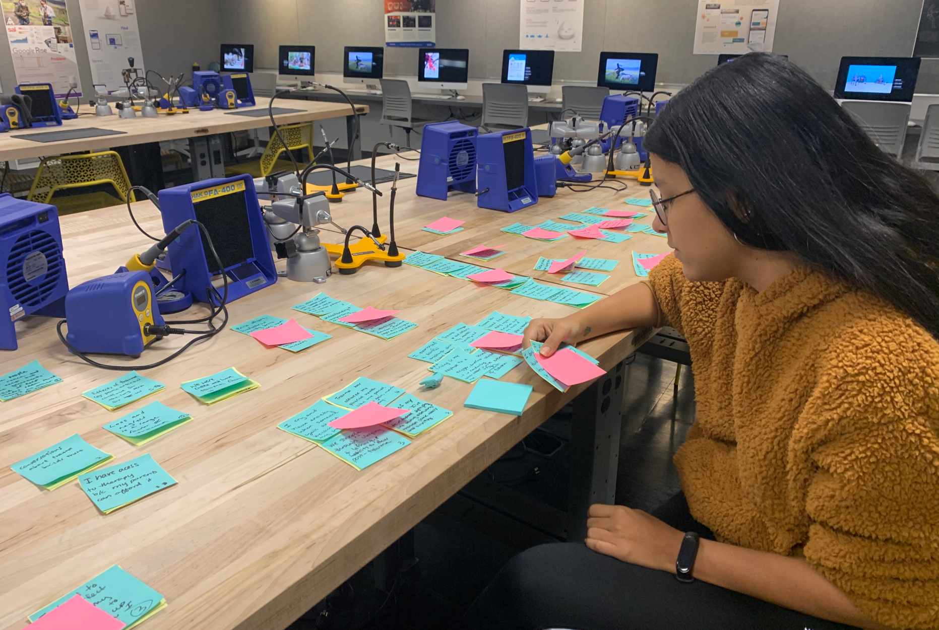
During our data synthesis phase, we found a few main factors that we needed to address in our solution. The main factor for preventing users from seeking trauma recovery is the price of therapy. Following closely behind, we identified social stigma; even for those who could afford, or have access to therapy, to be the next leading cause.

Fork in the Road
After we synthesized our primary research with user interviews, surveys, etc; we narrowed down two preliminary topics while concepting: Therapay and Cope. I came up with Therapay, and Tucker led the Cope direction.


We Have a Winner
With comprehensive decision making and opportunity mapping after our midpoint presentation, we agreed based on our skillset and resources, Cope was the winner. Cope involved a physical product, and with my background in industrial design I assured the team I had no problem leading product development. Shown is the first concept sketch I presented to the team shortly after out decision.

No-fi to Low-fi
We went straight into sketching and wireframing. Laura and I sketched out the user flow and initial wireframes for how the app would work. Laura and Cherie then developed our low-fi paper prototype to be user tested. Luckily, UX Alumni were visiting our school and able to user test for us early on.

Bubbles or No Bubbles?
As we dove into the mid-fidelity prototype, we needed to decide on the design language of the app. We had mixed feedback from our paper prototypes on the bubble design, but we saw potential in the bubbles to be a great place for interaction. So we decided to keep them and user test them further in our next stages.
It’s the Small Things
Leading UI, Tucker wanted a micro-interaction for the “add” button. I suggested a Pinterest-esque interaction that tucker ran with to create the feature that eventually appears in our final app.

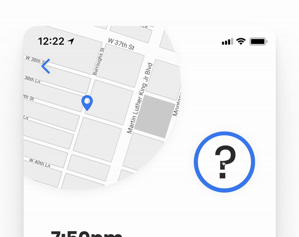
Audio Playback
Initially we wanted to include playback for auditory triggers. I was cautious on whether or not this was beneficial to the user or if it may lead to triggering them again. As a team we decided to use a warning modal (pop up) after they clicked play. For effectiveness, Laura and Cherie consulted a psychologist as they tackled the UX writing.

Simplification
We had a few iterations of our mid-fidelity prototype that went through a series of user testing. It became abundantly clear we needed to simplify the app to only it’s most essential parts; and avoid the feature bloat we had initially created.

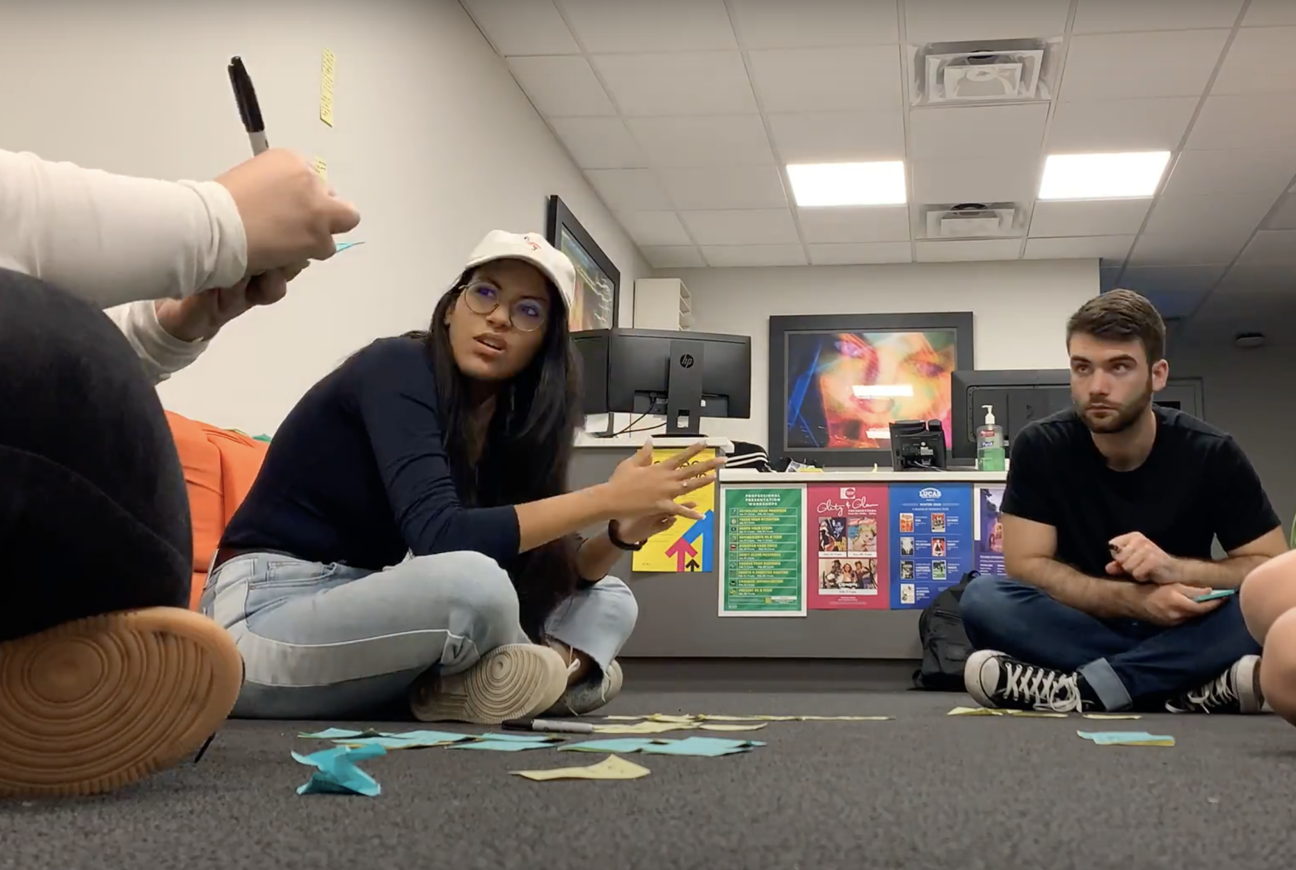
Teamwork
Above is from the last round of our mid-fidelity user testing, with an interaction designer from Google. Our goals were to assess coherence in our design language, and test the features and interactions we decided to keep before moving forward to our high-fidelity prototype. Cherie led the questions and prompts for user testing while Laura recorded the users’ responses. I observed how the user physically interacted with the screen.

Physical Prototype
During all this, I had been prototyping, testing, modeling, and 3D printing our physical prototype to be tested along with our mid-fi and high-fi wireframes.

Testing
I decided to test a variety of materials and locations, ultimately landing on a magnetic closure and haptic button. As a team, we picked and chose what features to get rid of and what to keep. The most essential were environmental sound recognition (ESR), GPS, and Bluetooth.
Branding and Deliverables
Juliana and I handled most of the final visuals and branding. I created the packaging for the product while Juliana made the directions. I then printed and designed the box to house the devices, while making visuals and graphics for our final slide deck and process book; creating a cohesive brand identity.
Areas of Improvement
This project was completed March 2020, since then I’ve spent a lot of time researching mobile interaction and animations. I feel our prototype could be much stronger in terms of transitions and interactions. If you have time, check out our vision video to the right to see how everything came together!
Index
Below are some of the tools, diagrams, personas, user journey maps, etc. we used throughout our design process, each one expands when clicked!

Age Research

User Groups

How Might We Statements

Primary Persona

Secondary Persona

Feasibility X Impact Diagram
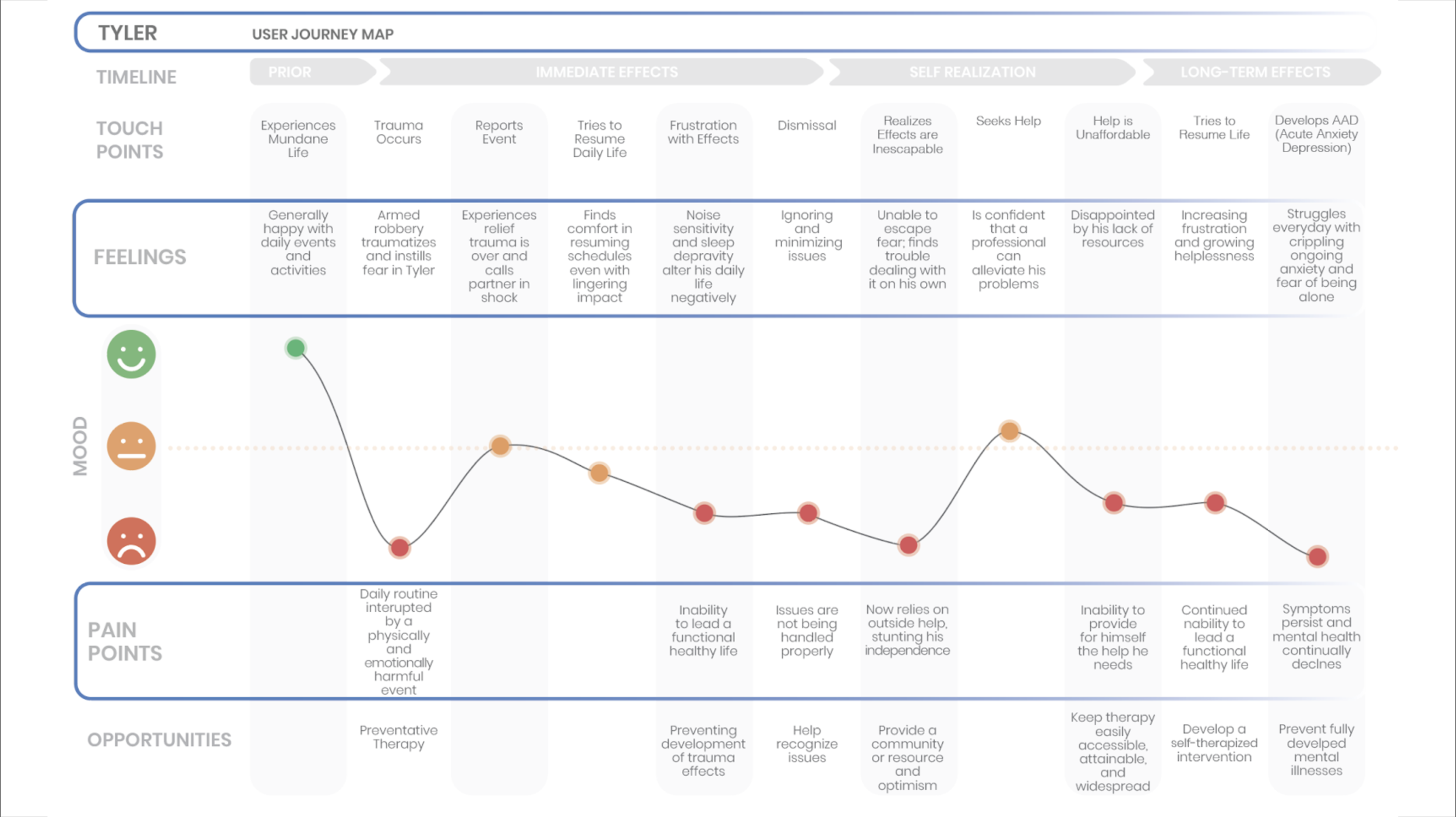
User Journey Map

Competitive Analysis I

Competitive Analysis II

Served Persona

Low-Fi Paper Prototype

Branding

Storyboard

Impact Map

User Testing Insights

User Testing Insights

Mid-Fidelity UI

Low-Fi User Testing

Low-Fi User Testing

Proposed Revenue Stream

Proposed Market Value

Copilot Exploded View

Mobile App Site Map

Accessibility Adjustments


Any Questions?
Thanks for making it all the way through this project! if you have any questions please feel free to reach out to me at charliebowlesdesign@gmail.com
Click here to return to all my work!