UX Research • Mobile App • Artificial Intelligence
Trucan : Fact-checking and Claim-making AI Assistant
Trucan is a 10 week academic case study researching and designing a concept to combat the spread of misinformation on social media. Inspired by Google’s material design, Trucan enables users to check sources, learn from unbiased recommendations, share pre-checked posts, and compare content to learn which is more trustworthy.
My Responsibilities / Contributions

Team

JT

Emily

Wyatt

Bailey

Charlie
Getting Started

Getting used to WFH…
For our UX Studio: Innovation class, we were given the objective to design a product that uses AI. With the project taking place March 2020, and being all of our’s first work-from-home project; we decided we wanted to tackle ✨misinformation.✨

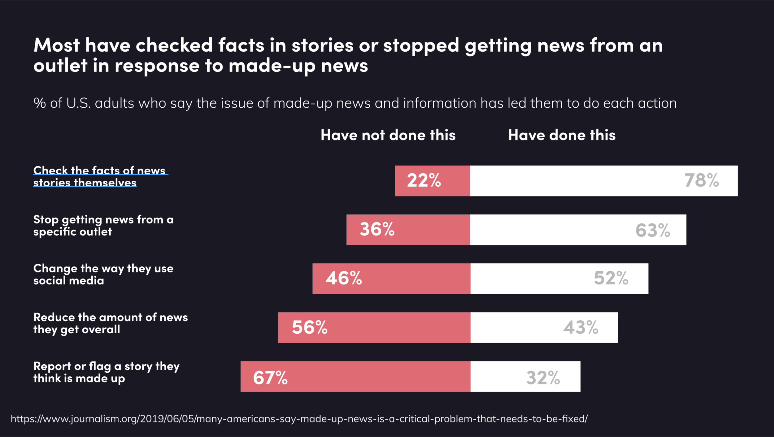
What’s Already Been Done?
AI and fact-checking isn’t new, so it was important for us to understand what exists already to see where we could innovate. Wyatt conducted the initial competitive analysis, and we found an opportunity space within misinformation on social media.

Will AI Even Work?
We interviewed AI expert Danko Nicolic and misinformation expert David Rapp to better understand if our concept was plausible, and what to look out for moving forward. We concluded the best methods to combat misinformation were Bot Detection, Reputation Calculating, and Stance Detection through AI.

Eye-Tracking Misinformation Study
We wanted learn exactly what cues people used when determining information to be true or not. I had the idea to track users’ eyes while they looked at misinformation. JT found and tested a few different services before deciding to use Real Eye. With this service we could generate heat maps of what people looked at over time. The team created a quiz of factual and misinformed social media posts, asking participants to talk out loud while determining if the post was trustworthy.
We found a pattern where older individuals (50+) looked heavily towards text when deciding to believe something, while younger users relied heavily on images when making their assumptions.

Plug-In, Extension, or 3rd Party App?
The team went back and forth on how we should implement this social media fact-checking service. We initially looked towards web-based plug-ins, but our research pushed us strongly away from it, since most social media is accessed by mobile devices. We then looked at creating a “bubble” using the Notification API for Android.

Who are We Even Designing For?
Through our research we discovered there are many different motivations and reasons people access social media. We categorized them into four umbrella groups. We narrowed our focus to fact-checkers, debaters, and a bit of influencers.
4 Main Features

Source Analysis
We found the most essential feature is the ability to analyze sources. We wanted to give a breakdown, summary, and data viz of what the source means, as well as it’s credibility. JT and I worked on the initial data viz for the source analysis as we moved into user testing our low-fi prototype.

Claim Maker
The team wanted to tackle misinformation from multiple angles. While the analysis and comparison are for users absorbing information; the claim maker is for those wishing to share accurate information. I led the claim makers concept, which uses AI to populate credible sources while the user types.

Source Comparison
Similarly to the source analysis, the source comparison provides the same data, with additional insights on how two sources stack up against each other. We tested this feature because our research found a problem space when users compare information from multiple locations.

TruType Keyboard
We added a keyboard extension of our app that acts as an abridged version of our 3 previous features. The advantage of this is users would not have to leave the social media app they are currently in. If I were to do this project again, I would focus more on the keyboard extension, since we found in our later testing it was many peoples’ favorite feature because of its convenience.

User Testing During a Pandemic
With this being the first time we had to navigate user testing virtually, we weren‘t exactly sure how to approach it. We explored online or paid user testing services, however we wanted the ability to prompt and speak with users while they were testing our application. We ended up having our testers share their screen on zoom while they navigated our prototype on Figma. However, this approach wasn’t perfect, since mouse interactions and touch interactions are different; but we were still able to gather enough information to develop our screens further.
The main feedback we received was improving onboarding, since users were still confused once they finished our initial onboarding prototype.

System Usability Scale (SUS)
To assess our low-fi prototype user testing, we used a system usability scale. Users would fill out questions based on usability and we averaged them together for a score. This goal is to perform the same process in later stages of testing and receive a higher average.
In this stage of user testing, users noted it was unclear on what exactly they should be clicking or tapping. The team believed this could be improved by adding color; so with that we moved on to our mid-fi screens.

UI / Interaction Issues
We struggled a lot with finalizing our source comparison UI. JT and I specifically iterated and user tested different layouts until we could find one that satisfied our users. Shown is only a few iterations we went though, but the screen on the right is the final UI for the source comparison we went with.

Color Scheme: Light V Dark?
As we developed our high-fidelity prototype, we went back and forth on using a light color scheme, or a dark one. We ended up going with a darker color scheme to match social media. Keep scrolling to see how it turned out!

Branding and Deliverables
As we developed our screens and did our last round of user testing, we finally landed on a darker color scheme. JT and I finished the final UI, while Wyatt finished the vision video (below). Emily came up with the initial “Trucan” logo that we ended up using in our final UI and branding.
Areas of Improvement
This was our first project during a pandemic. Looking back I personally learned a lot about collaboration and user testing. Before this, I always preferred affinity mapping with tons of sticky notes in front of me on a wall. Moving forward I prefer using collaborative programs like Miro and Figma. I love the accessibility with having data stored digitally, as well as easily being able to recall our raw data when looking for insights. With all that being said, I’m looking forward to when I can collaborate in person again :)
If I were to develop this further I would bring Trucan to desktop as a plugin!
Index
Below are some of the tools, diagrams, personas, user journey maps, etc. we used throughout our design process, each one expands when clicked

Secondary Research I

Secondary Research II
Secondary Research III

Competitive Analysis

Stakeholder Map
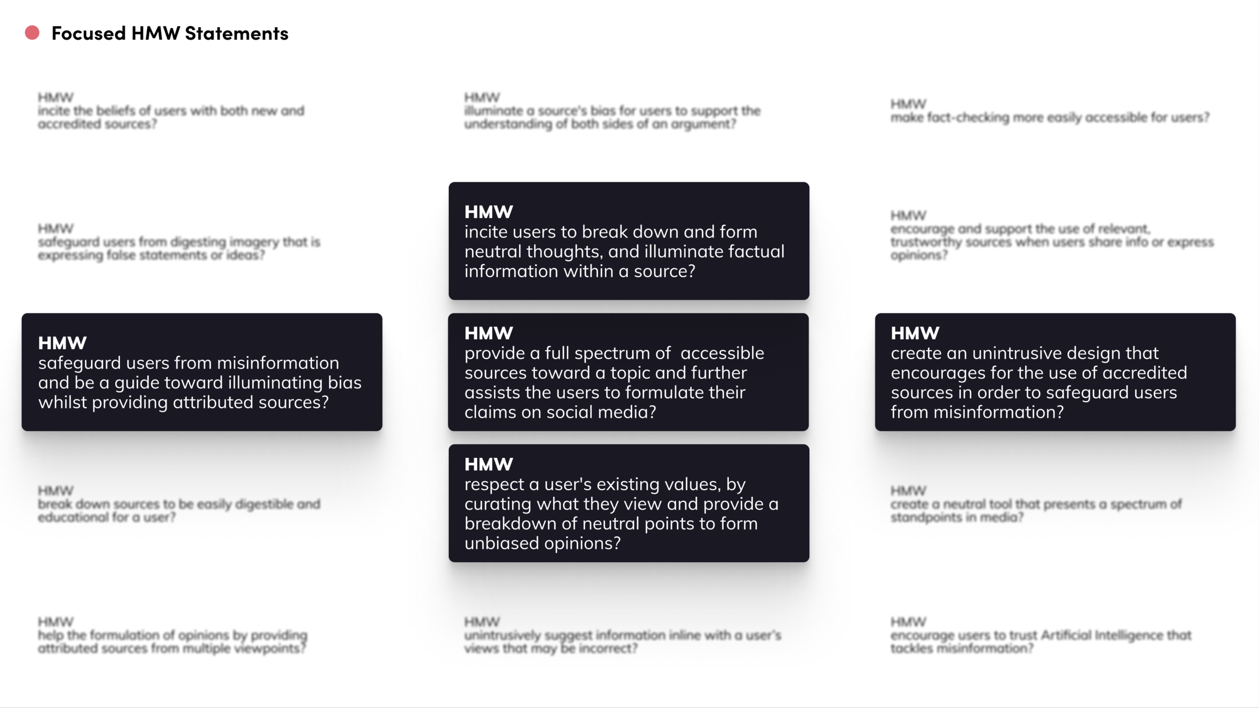
"How Might We" Focus
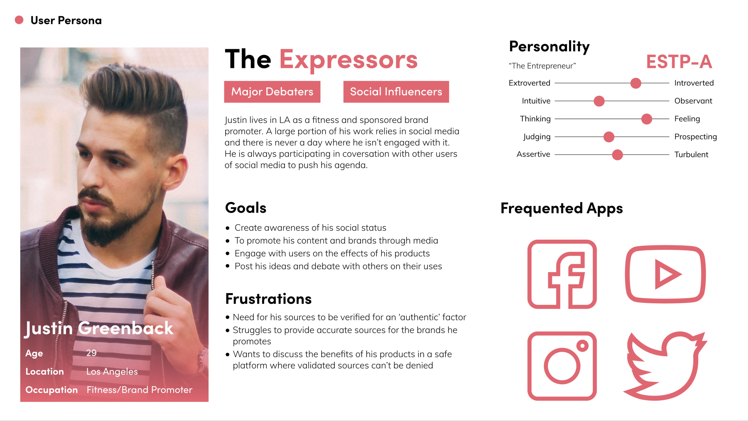
User Persona I

User Persona II

User Journey Map

Opportunity Map

Initial Concept Storyboard

Concept II Storyboard

Lo-Fi Sketches

"Perceiver" Storyboard

"Expresser" Storyboard

Business Model (Lean Canvas)

AI Limitations

Source Visualizer

Source Comparison

Claim Maker

TruType Keyboard

AI: Stance Detection

Mid-Fi Wireflow

AI: Reputation Calculating


Any Questions?
Thanks for making it all the way through this project! if you have any questions please feel free to reach out to me at charliebowlesdesign@gmail.com
Click here to return to all my work.